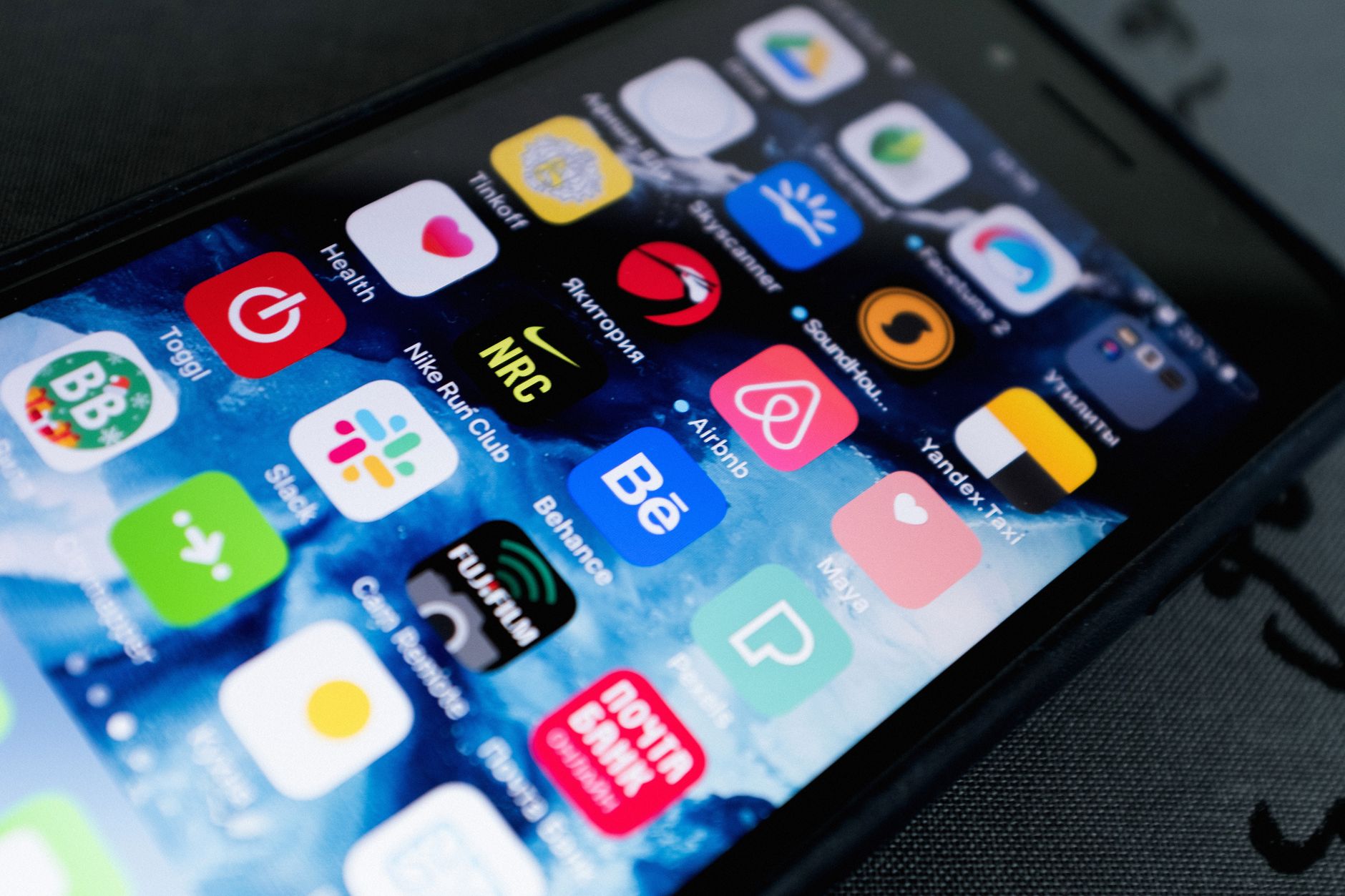
Android’s Material You system, introduced with Android 12, was supposed to solve something real: the phone that feels like yours. Pull a wallpaper, watch the system extract a color palette, apply it to every surface - buttons, toggles, notification cards, the dialer. Google called it dynamic color. The idea was coherent. The execution, four years on, is a mess.
The problem isn’t that Material You doesn’t work. It mostly does. The problem is that “yours” and “consistent” are in direct conflict on Android, and Google has never picked a side.
App developers are under no obligation to follow Material You guidelines. Some do - Google’s own apps do, more or less. But Spotify ignores it. So does Instagram. So does every banking app ever built. The result is a phone where the settings screen is a warm terracotta and the app you spend three hours a day in is a flat black rectangle that refuses to acknowledge any of this. The homescreen feels designed; everything else feels like browsing a mall that didn’t agree on a floor plan.
Apple gets criticized constantly for locking things down, but the rigidity produces something real: visual coherence between system UI and third-party apps. iOS’s design language gets adopted by developers because the App Store review process and the cultural pressure of the platform both push in that direction. Not perfectly - plenty of iOS apps look terrible - but directionally.
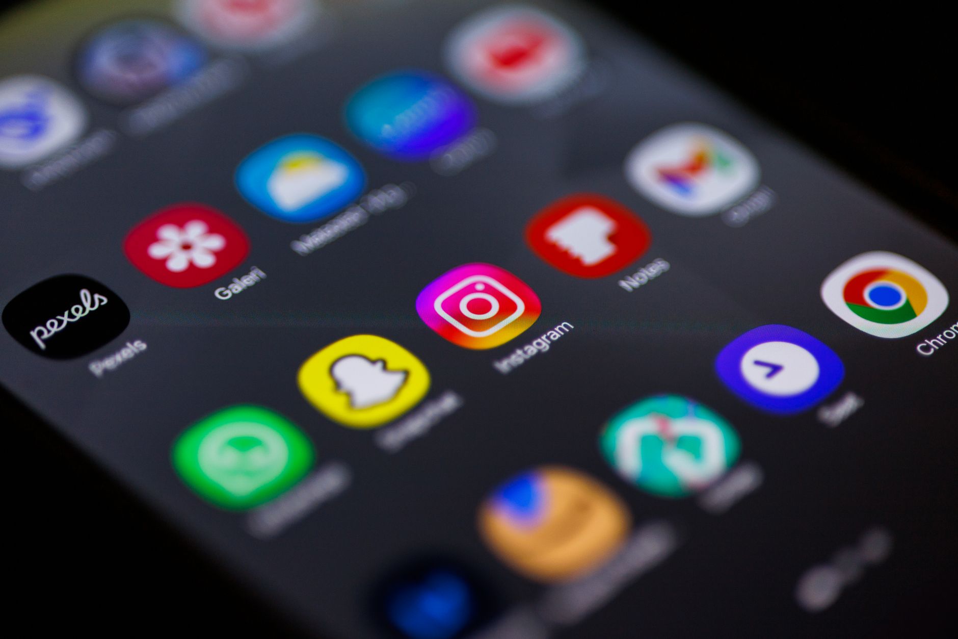
Google has no equivalent leverage. Android is too fragmented across manufacturers, too open, and too dependent on developers who are simultaneously shipping on iOS and just porting over. The incentive to build a truly Android-native UI is low when a cross-platform Flutter or React Native app ships faster and costs less.
What makes this worth raising now is that Android 16 is adding more theming options, not fewer. Larger text scaling, adaptive layouts, more wallpaper-driven customization hooks. Google is deepening a system that already has a coherence problem, betting that more expressiveness is the answer when the real issue is that expressiveness without adoption is just noise.
Personalization theater - where the settings screen promises a unified look that the actual app ecosystem can’t deliver - doesn’t serve users. It serves the announcement slide.
Android’s openness is genuinely valuable for a lot of things. Making a phone look intentional isn’t one of them.